North Park Hill, Denver
A mixture of transitional and midcentury-modern design in a classic and charming Park Hill home
Before & After
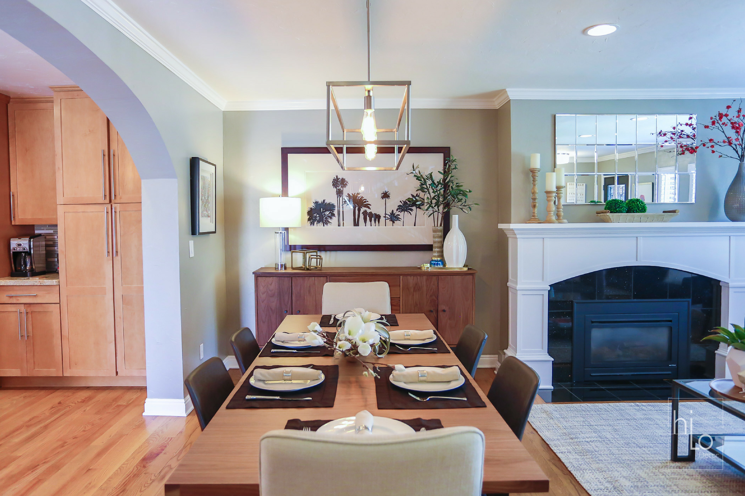
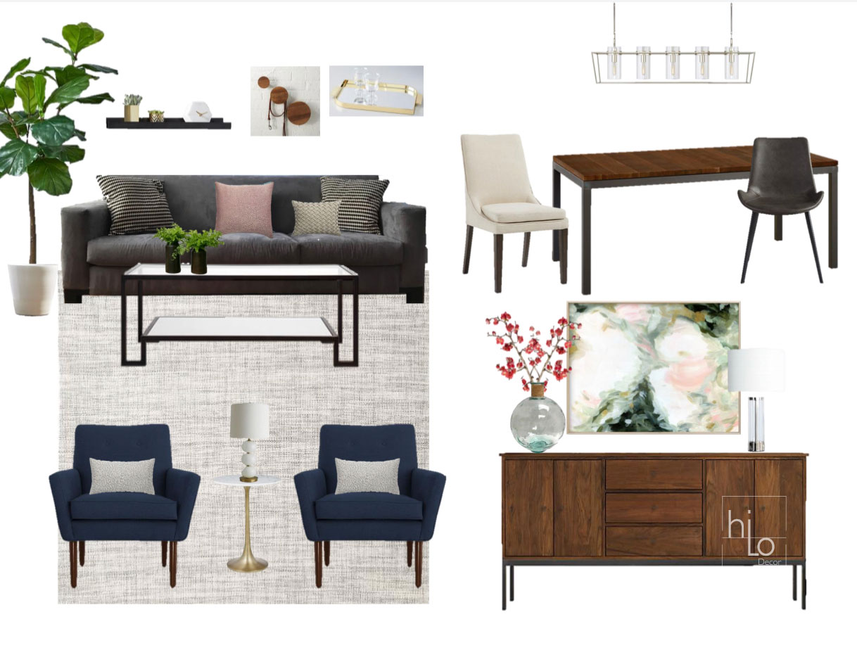
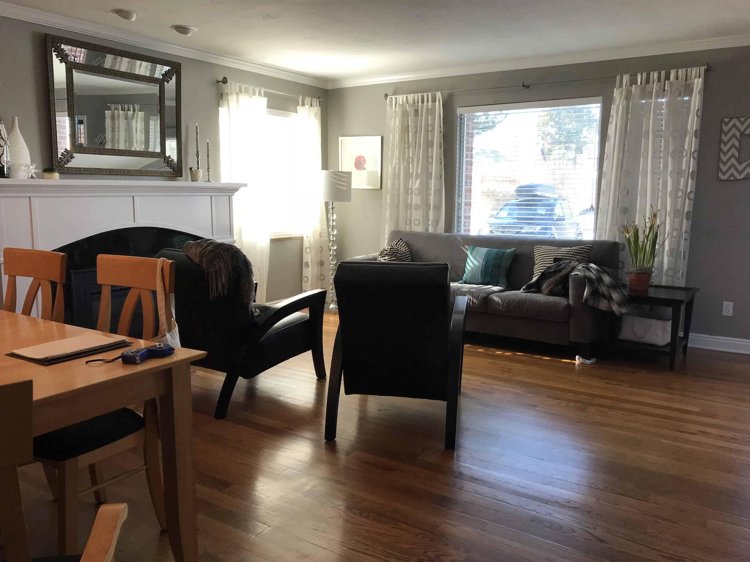
Furniture layout can make or break the look and flow of the room, and the original layout for the living space lacked a focal point due to the arrangement of the furniture. Consider the architectural features of the home when determining your focal point and space planning. By repositioning the sofa in front of the fireplace and styling the area it naturally allows the eyes to be drawn to the fireplace which serves as an entry point to discovering the rest of the room. We also added a rug to anchor the furniture and wrapped a couple of side chairs around it to clearly define the living room from the dining space. To make the space look bigger and brighter, we added recessed lights and also replaced the dining chandelier to modernize the space.
For the dining space, rather than buying a dining set, it can be more interesting to mix wood finishes and different styles of chairs. Due to little kids and their naturally dirty hands around meal time leather chairs were selected for easy clean up, as well as a couple of upholstered chairs for a more sophisticated and thoughtful look. The teal vintage sideboard was repainted to a clean, crisp white, so it seamlessly blends in with the rest of the decor.


